Visuals
How To Draw For Storyboarding (article) - MASSIVE collection of information about storyboarding. Most apply to drawing in general. Tons of useful knowledge here!
Silhouettes: the Silent Killer (article) - Aaron Diaz
22 Panels That Always Work (image) - Wally Wood
Drawing & Composition for Visual Storytelling (article) - Ron Doucet
Excerpts From Cartooning the Head and Figure (pdf) - Jack Hamm
Quick Poses (webapp) - Massive, free pose library for figure and drawing practice.
It’s the moment you’ve all been waiting for! It’s finally time for the actual art of your comic!
Well there’s a lot to cover here so strap yourself in and let’s get down to it.
- Whenever possible, guide the reader’s eye to the next panel. You don’t ever want your reader to be confused by the layout of your page (this will immediately pull them out of your story) so make sure it’s always clear where they should look next. This is mainly achieved through the layout of the panels themselves (see the previous section) but the elements within a panel can have an effect as well.

Use “leading lines” such as pointing fingers or limbs or the natural shape of objects, to help point the reader to the next panel. The direction characters are looking can also be used to guide the reader since we naturally want to look at things that other people are looking at. Some good examples of pages that do this well can be found here and here.
-
Make sure each panel has at least one focal point. Focal points help show the reader what’s important within a panel. Without them, a panel risks getting jumbled and unclear.

There are a few ways to create focal points within a panel:
- Use the faces of characters.

Eyes are naturally drawn to faces so if you have a character in a panel whose face is clearly visible, chances are it’s a focal point.
-
Varying the levels of detail in a panel. Areas that are more detailed compared to the rest of the panel will draw our attention to them. Think of how a camera can only focus on a small number of things in a single photo. The further away something is from the focal point, the more blurred it gets.
-
Using leading lines.
 Towards Eden - Lo Vicente
Not only can leading lines be used to guide the reader to the next panel, they can also be used within a panel to create focus. Remember, leading lines can take the form of many things, including perspective lines of buildings and objects, and even character’s limbs and eyes.
 Towards Eden - Lo Vicente
A character looking at and pointing towards something, usually makes it the focus of the panel.
- Intersecting perpendicular lines.

The point where two or more leading lines intersect becomes a main focus of a panel since it’s where the reader’s eye is repeatedly drawn towards.
-
Avoid putting two focus points too close together.

You can have multiple focal points within a panel but if you place them too close together they’ll be competing for the reader’s attention, resulting in a muddled and confusing experience.
- By varying line thickness, you can add depth to your panels.

Thicker lines are often used for elements in the foreground of a panel since they’re closer to the reader. Line thickness can also be used to draw or hide focus of certain elements within the panel because larger, thicker things tend to pop from the page and attract the eye first.
-
Avoid tangent lines in your drawings. Tangent lines (which you may remember from math class) are lines that butt up against each other in some way. When done unintentionally in art, these lines make objects feel connected or flat when they shouldn’t be. Some good examples of what I mean can be found here and here.
-
The direction your characters face/move matters. For whatever reason, we as a society have unconsciously created a meaning behind directions.

-
Moving left to right means progress. Most likely as a consequence of the western world’s influence (being on the LEFT side of the globe and reading left to right), those who move from the left to the right are perceived as trying to grow and move forward. Those who move right to left are seen to be hindering the progress of those on the left. Because of this, we often see protagonists on the left side of the page, and antagonists on the right.
-
Moving back to front means and increase in power. This is because a character who moves to the foreground would be taking up more space in the panel and thus are seen as more important.
-
-
The angle at which characters are framed reflects their perceived power. When I say angle, I mean where the camera is placed relative to them. Notice that a comic panel can be understood as a window for the reader into a scene. By changing the point of view of the reader, you change how a scene, and the characters within it, appear to the reader.
- Angling up at someone makes them look powerful.

Tall and large things are often perceived as strong. Angling the camera up at a character makes us feel shorter than them, framing them as confident and potentially intimidating.
- Angling down on a character has the opposite effect.
Looking down on someone makes us feel more powerful than them (that’s where the phrase “looking down on someone” comes from). By angling down on a character, they seem to have less control than us and so are perceived as weaker.
- A level shot on a character makes them more relatable. This is because they’re shown on equal ground to the reader. They see the world like we do and that kind of familiarity makes us inherently more comfortable with them.
 Towards Eden - Lo Vicente
Level shots are often used when framing the protagonist of the story, since they’re usually the one we’re supposed to like. They’re the vessel for the reader.
This same rule applies no matter what the positioning of a character is. If they struggle and fall, placing the camera down next to them keeps the reader in the perspective of that character, feeling the same emotions that they do.
-
Similarly, how characters are framed relative to each other reveals who is in control.

A character who is standing above someone else looks more powerful than them. Characters lying on the ground are seen to be weaker compared to someone kneeling beside them.

The following page covers the previous two points fantastically:
 Towards Eden - Lo Vicente
Notice how initially both characters are framed evenly. Despite the situation, neither seems to have noticeable power over the other. As we enter the second tier, the woman becomes larger in the frame. We see this reflected in the dialogue as the man is put on the defensive. By the third tier, the woman is framed significantly higher up compared to the man. The man has to look up to make eye contact with her. This, in combination with the dialogue, goes to show that she’s gained control of the scene.
Also notice where the camera is placed in that final tier. We’re on the same level as the man and thus are sharing in his experience. We’re looking up at the woman as well. She’s looking down on us just as much as she is on the man.
-
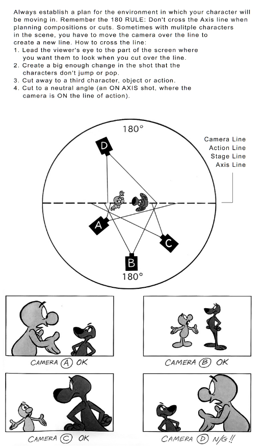
Follow the 180 degree rule. This is to keep characters on the same side of the panel throughout a scene. There are two reasons we want to do this. First, it makes the scene easier to follow for the reader. Second, it establishes and maintains the power dynamics between characters in your scene. (See the previous point on direction.) If you want to break this dynamic, the 180 degree rule can be maintained by clearly establishing a new line through character or camera movement. Here’s a video demonstrating the point.
-
Avoid having too many parallel lines in your art. Unless you’re intentionally aiming to show a pattern or symmetry, drawing characters with curves at varied angles makes them feel more lively. (Some examples here and here.) The same can be said about objects and scenery.
-
Know how body language reflects how readers perceive your characters. This guide is absolutely amazing and conveys everything I could think of regarding body language.
To cover just a few points the guide makes:
-
The distance between characters and how tight we pull the camera in reflects the amount of intimacy. The closer together, the more intimate (strangers vs friends vs lovers). The same goes for the reader. The closer we zoom on a character reflects our emotional connection to them. Zoom out on a character to show their loneliness. Zoom in on them to have the reader feel it with them.
-
A character’s body position in a conversation reflects how comfortable they are. Characters that stand sideways or have their arms folded are uncomfortable. Ones that stand face to face or lean in to the other person are more interested.
-
Character posture affects their perceived confidence levels. Characters who stand tall with their chin held high and their shoulders back, appear as more confident than those who slouch.
-
-
Remember the rule of thirds.
-
The amount of space a character takes up in a panel reflects their power.

Two people evenly spaced in a shot shows us they’re in balance. If one character takes up a majority of the panel, forcing the other up against the border, we can infer that this character is in more control than the other.
- Camera placement matters during conversations.

Keeping the camera in the middle of the two characters makes for a more natural and intimate feel, while wider or over the shoulder shots can make us feel like observers.

Placing the camera further away, at skewed angles, or obscured behind some scenery can add a level of unease, sometimes making us feel like we’re spying on the characters.
- Note that backgrounds are not required in every panel.
Backgrounds are important when setting a scene or if the setting itself is important to the telling of your story, but if the focus is on your characters and nothing else, adding a background could potentially become a distraction for readers.

Another thing to note is the more detailed a background is, the more it slows down the pacing of a scene. This is because detailed backgrounds give the reader more to examine within the panel. This is great for scene transitions where you want to reset the pacing but not so great when you want to start ramping up the stakes. For this reason, most action panels drop the background out completely.
You can also drop out a background to add special emphasis to a big moment or a shocking reveal.
There are many other factors that can help you decide the degree of detail you want to include in your panels. If you’re feeling unsure, remember everything should serve a purpose. If you can justify it, keep it in.
Here’s a fantastic video by Strip Panel Naked about background usage.
-
Know how and why establishing shots are used. Establishing shots or panels do exactly that: help establish a scene. Their primary use is to show the reader more about the setting where the scene takes place in, but they’re also used as framing for the characters so the reader knows where everyone is relative to each other. Establishing shots can also be used to show the tone and style of a setting and help provide a bit of visual background information for the reader. Establishing shots are usually the first panel of a scene but can be delayed to build suspense or to show that your character is unaware of their surroundings. Whyt Manga made a great video on the topic.
-
The higher the contrast, the more dramatic the mood.

As a general rule, adding heavier shadows and higher contrast, especially to the muscles and bones of faces, increases the drama.
Table of Contents
Intro
Before You Start
Writing
- Overview
- It All Starts With An Idea
- Thought Dumping
- Outlining
- World Building
- Characters
- Writing Scenes
- Breaking Scenes Down
- Scripts
- Dialogue
- Revision
- Choosing A Title
- Writer's Block
Hiring A Team
- Overview
- Sorting Out Your Budget
- Writing A Solicitation
- Where To Find Your Team
- What Makes A Good Partner
- Contracts
Drawing
Colouring
Lettering
- Overview
- General Tips
- Standard Black vs Rich Black
- Choosing A Font
- Font Types
- When To Bold Text
- Sound Effects
Marketing
Publishing
Printing
- Overview
- Getting Print Ready Files
- Offset vs Digital Printers
- Why Page Count Matters
- Book Formats And Binding Types
- How Many Copies To Print
- Aesthetics
- Tips For Saving Money
- Printer Comparison Table